How to Make a Website: a Step-by-Step Guide
5 steps to create a website, main features of Tilda, links to useful resources, and practical advice

It's a challenge to create a good website. That is the reason we made this guide which will help create a website without a big team, within a reasonable period of time, and with a low budget. We broke down all of the insights gained during 20+ years of work in web design, compressed this knowledge, and explained how to apply it using Tilda — a platform that helps make awesome websites. Read, create, and you'll make it happen!
1
The idea and structure of a website
Main idea and purpose of a website. One page or several? Website structure, main blocks.
Think of the sections that your site will consist of, what will be the main idea and function. For example, a client needs a website of an architectural bureau. There is a general understanding, that there must be the bureau's works and contacts. However, we must ask the question: how is this bureau different from others? It turns out that the bureau focuses on big, difficult projects and is an expert in such commissions. We conclude that good pictures with explanations are not enough , there is need for a text which includes detailed descriptions of benchmark data, the process, explanations and justifications of decisions. We also understand that there are a lot of projects, however there is no need to show them all. We centre on the major ones. There is another moment - we have to tell about the people and explain why they are experts in their field of work.
Don't drift towards animation, embellishment and special effects. Define the superior idea, the main point which will emotionally involve, impress and inspire the visitor.
Don't drift towards animation, embellishment and special effects. Define the superior idea, the main point which will emotionally involve, impress and inspire the visitor.
For example, you need to create a landing page for a school of design. The main purpose of the page is to explain to future students and their parents who a designer is.
Problem: Pupils want to become designers, however, they frequently don't understand the specific character of the profession, what are the trends in design, what is the difference between them.
Objective: To help future students get to know web design specializations and understand which one suits them best.
Idea: What if we highlight several main design trends — interactive, graphic, industrial design and interview the brightest practitioners of the three? Personal stories are very emotional and always work well. We can tell how they live, how they achieved success, add great photos. People will be interested to read it, they will see what kind of person each professional is, whether their lifestyle is inspiring or familiar.
Open a text editor and write down the structure in form of a list. Evaluate the volume and think if this information can be fitted on one page. If there is too much information, then the website needs to be multipage. In this case think which sections can be brought out into the menu.
A detail: refrain from writing the main page as a beginning of a "tree". Let the contacts page have the same level as the main page. This will help when you start making navigation.
A usual text editor or a list of paper — these are the necessary materials to outline the structure.
2
Research
Competitor websites. Cross-categories. Inspiring examples.
Competitor websites. When you settle upon the main idea of the website and its structure, take a look at competitor websites and find the right answers. Judge them not by their looks, but by the content: the composition of the menu, what was brought out to the main page, the website sections, what is written and how.
Cross-categories. If you are developing a website for a play, look at similar websites. Can't find a good website for a play, consider something from a close category: an opera or a modern dance website. If there is a need to tell about a football team, one can use methods found on hockey or rugby websites.
Cross-categories. If you are developing a website for a play, look at similar websites. Can't find a good website for a play, consider something from a close category: an opera or a modern dance website. If there is a need to tell about a football team, one can use methods found on hockey or rugby websites.
Competitor websites can have no style or look bad, however, if the guys are making money that means they are doing something right there. Your goal is to understand what is it.
Inspiring examples. Even people with extensive experience in web design look through new websites on a regular basis, follow trends, find inspiration in colleagues' works. You don't need to copy from others in order to get inspired, the idea is that you stay up to date with the ever-changing world of web design and are perfectly aware of what is trendy and cool.
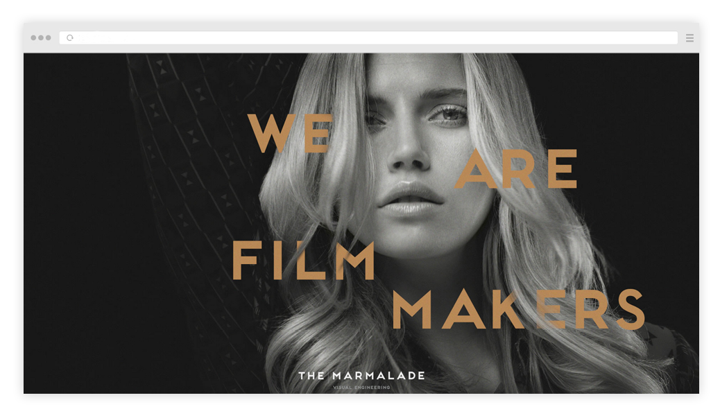
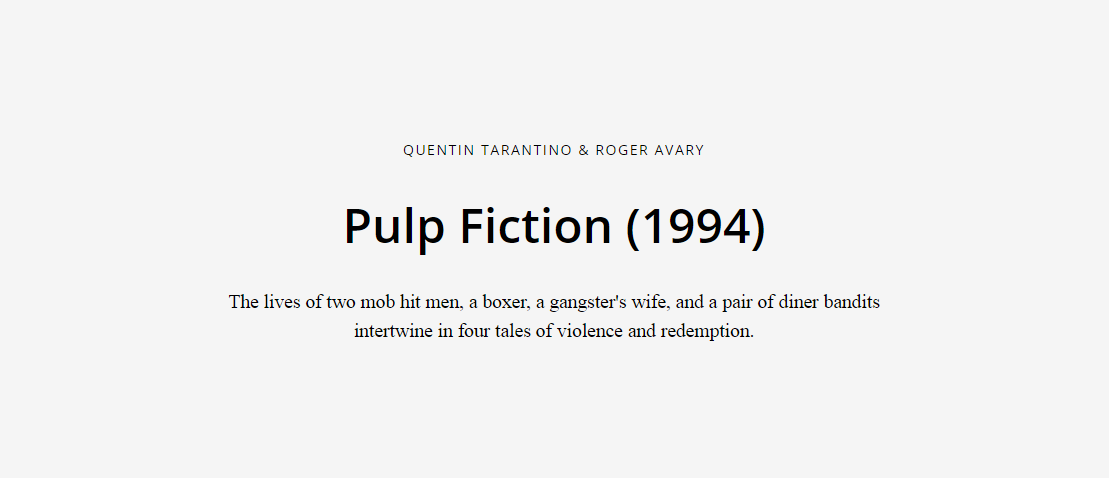
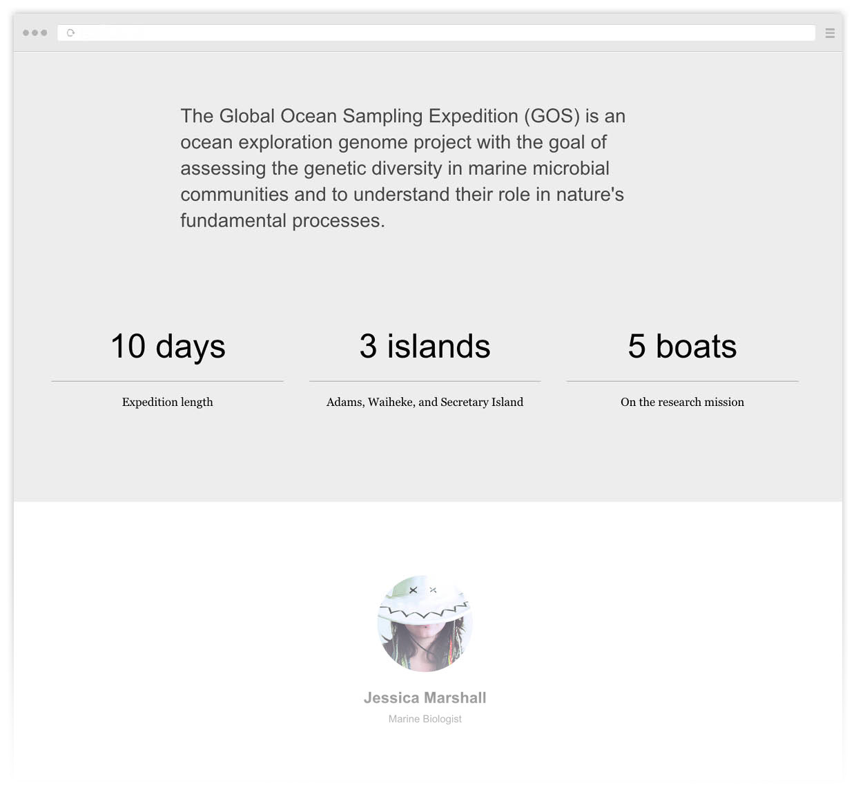
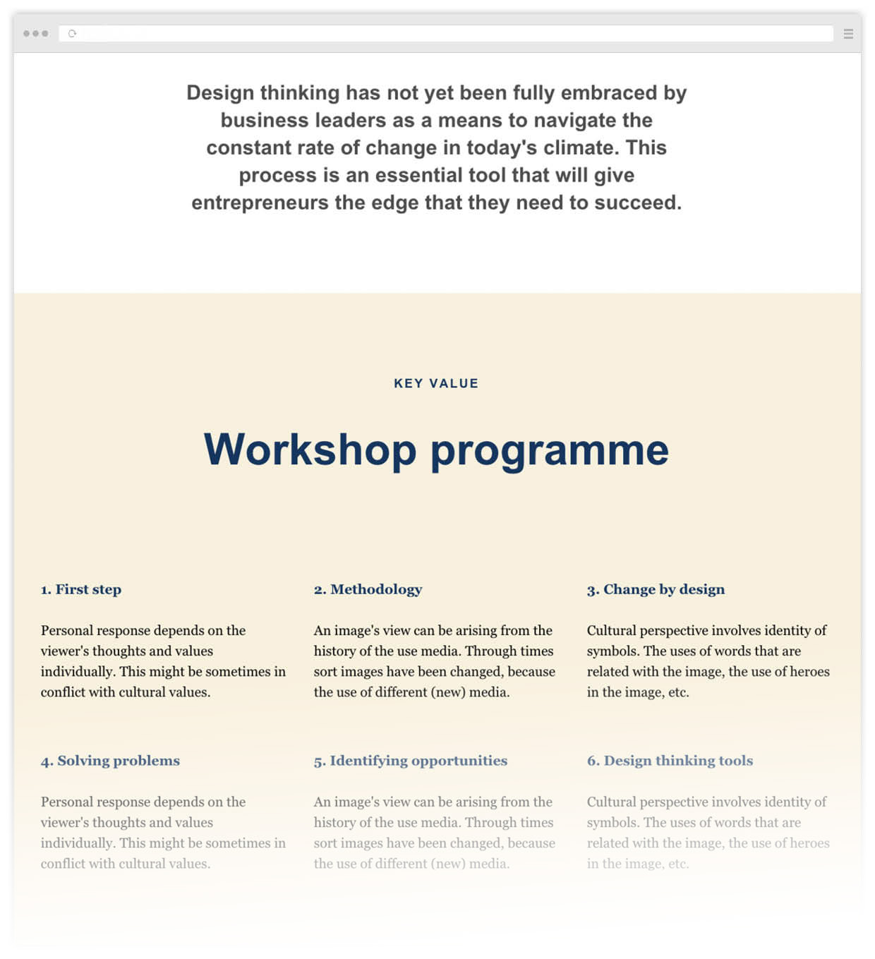
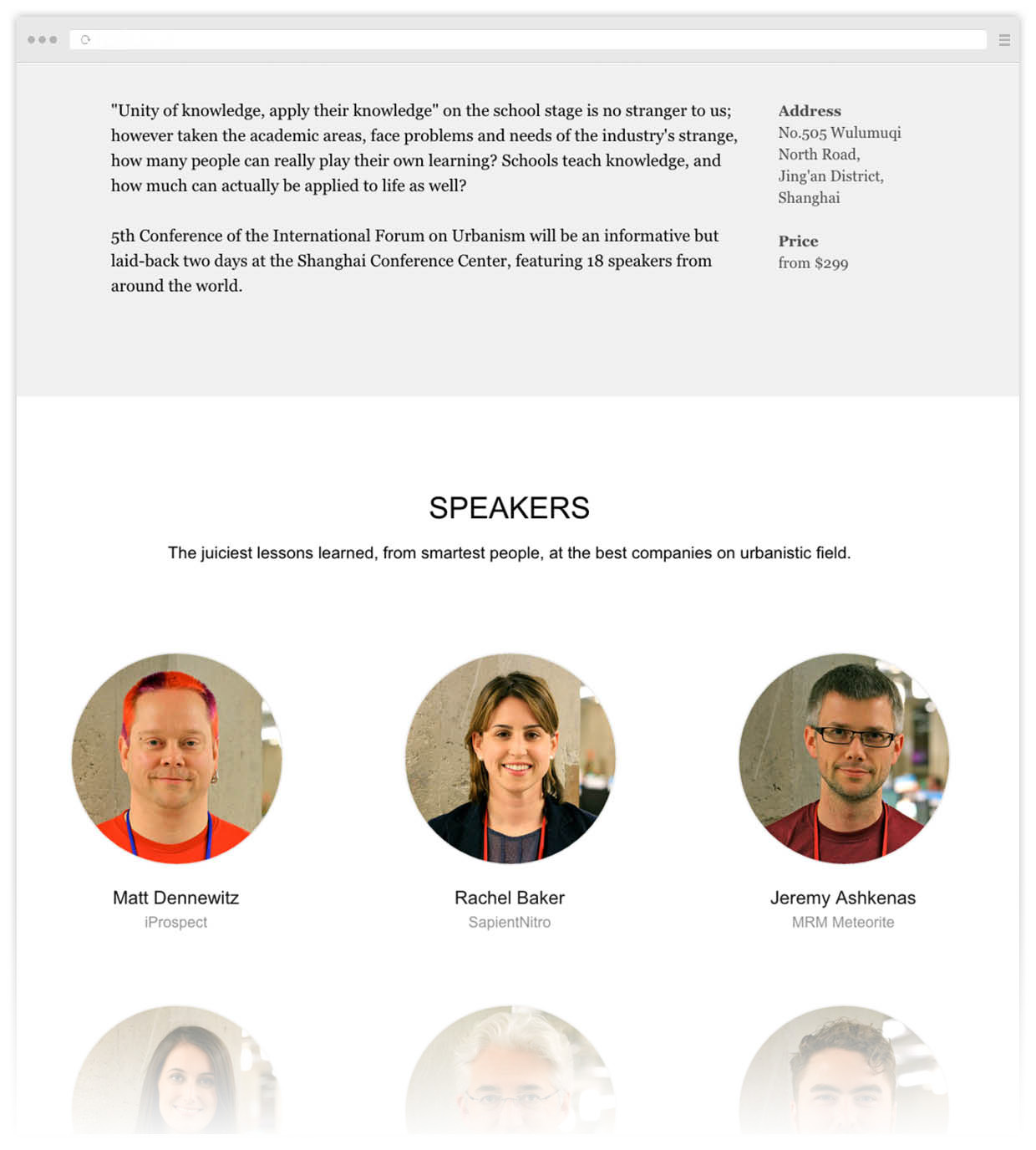
Main and inside pages examples of well-made websites.
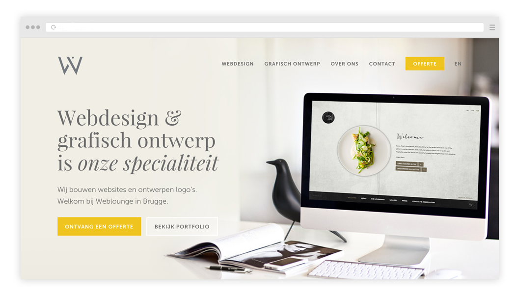
Main and inside pages examples of well-made websites.
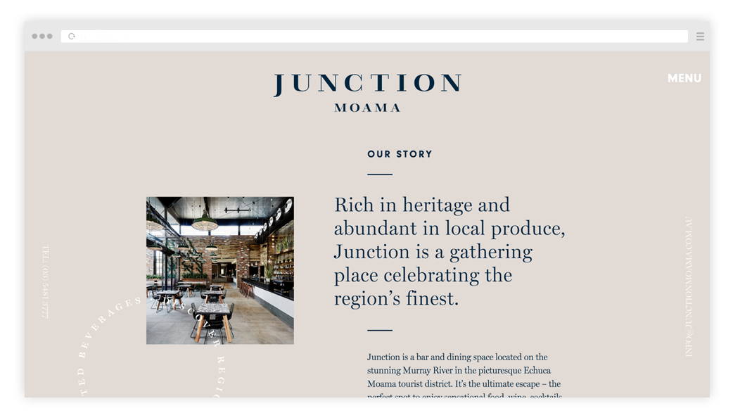
Main and inside pages examples of well-made websites.
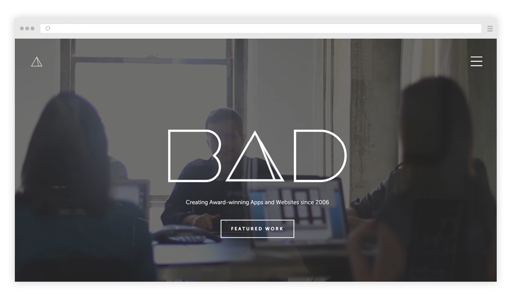
Main and inside pages examples of well-made websites.
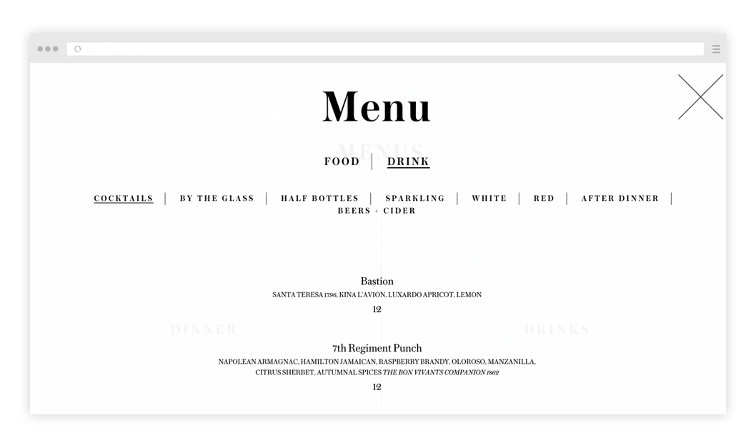
Main and inside pages examples of well-made websites.

Main and inside pages examples of well-made websites.
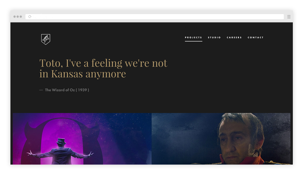
Main and inside pages examples of well-made websites.
Listen to yourself and define what exactly you like. Maybe it's a well-taken photo, nice typography, or the selection of colours. Look for expressive methods that you can use in your work. Here you have to look at all the websites, regardless of the industry.
Below are links to some resources featuring collections of good examples.
Below are links to some resources featuring collections of good examples.
3
A website prototype or mock-up
What is a prototype. Examples of prototypes. How to draw a prototype, basic elements.
What is a prototype? You looked at the competitors, got inspired by the cool examples, and some ideas have already appeared in your head. Now you need to graphically express these ideas – make a sketch.
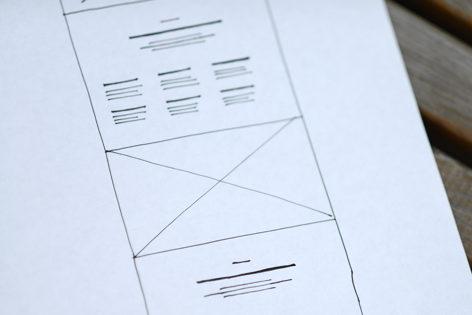
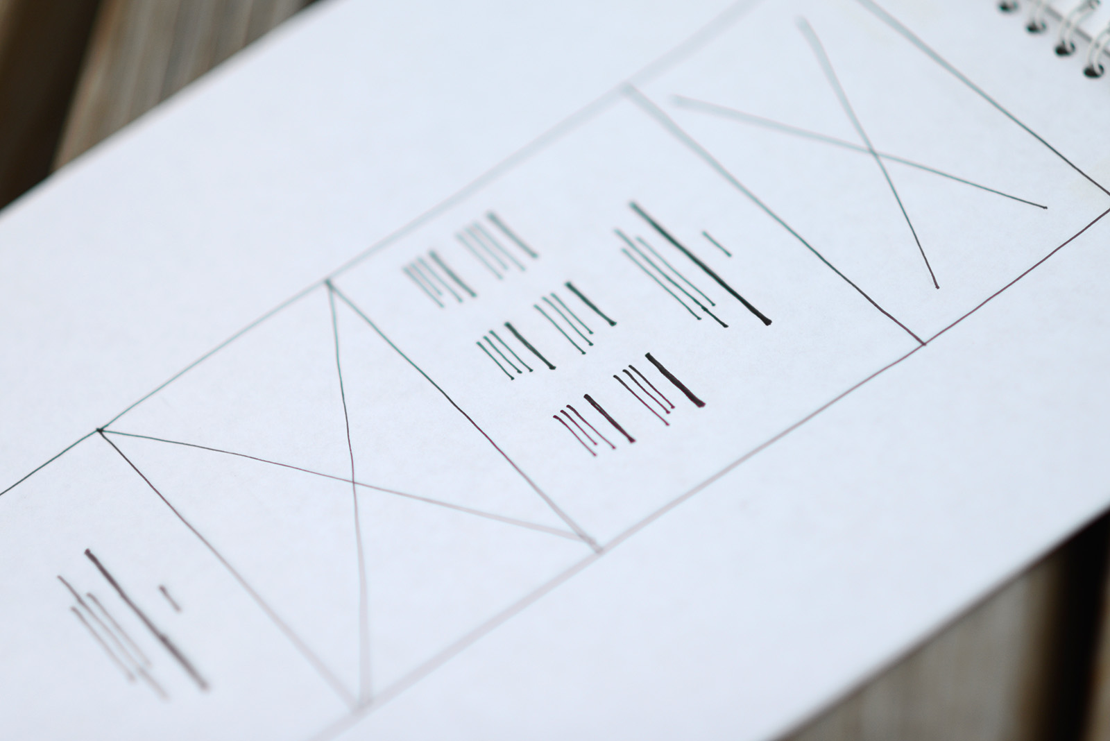
A draft website or prototype is a schematic representation of the website's blocks. Your visual scenario.
It's easy to do. Take a paper, two markers — a black one and a contrasting one and draw a plan listing everything in order. There is no need for detail - only the main idea. You need a script of your webpage. See it as a presentation, think in screens. What did you want to say? Probably, you have to show a something cool first, something that will impress and make it clear for the visitor where he is. Then shortly tell about yourself, after that outline three advantages, the team, several best works and contacts. Now you need to just draw everything as it is.
Examples of how prototypes look.
How to draw a prototype. There is a basic set of standard elements. The text is shown by straight lines, the headline is bit bolder. The picture is a rectangle with crossed lines, the operating elements are like little pins. The head is the strip at the top. On the left, for example, a bolder dash line for the logo, on the right are five dash lines for the menu.
Advice: Don't make the prototype too big. For example, on an A4 paper size the the window width must be 5-6 cm. Its better to be compact and schematic and write comments in the margins.
Try to draw accurately — it will be easier to perceive. Usually, there are a lot of ideas, so make several versions and then discuss with colleagues, which one is better.
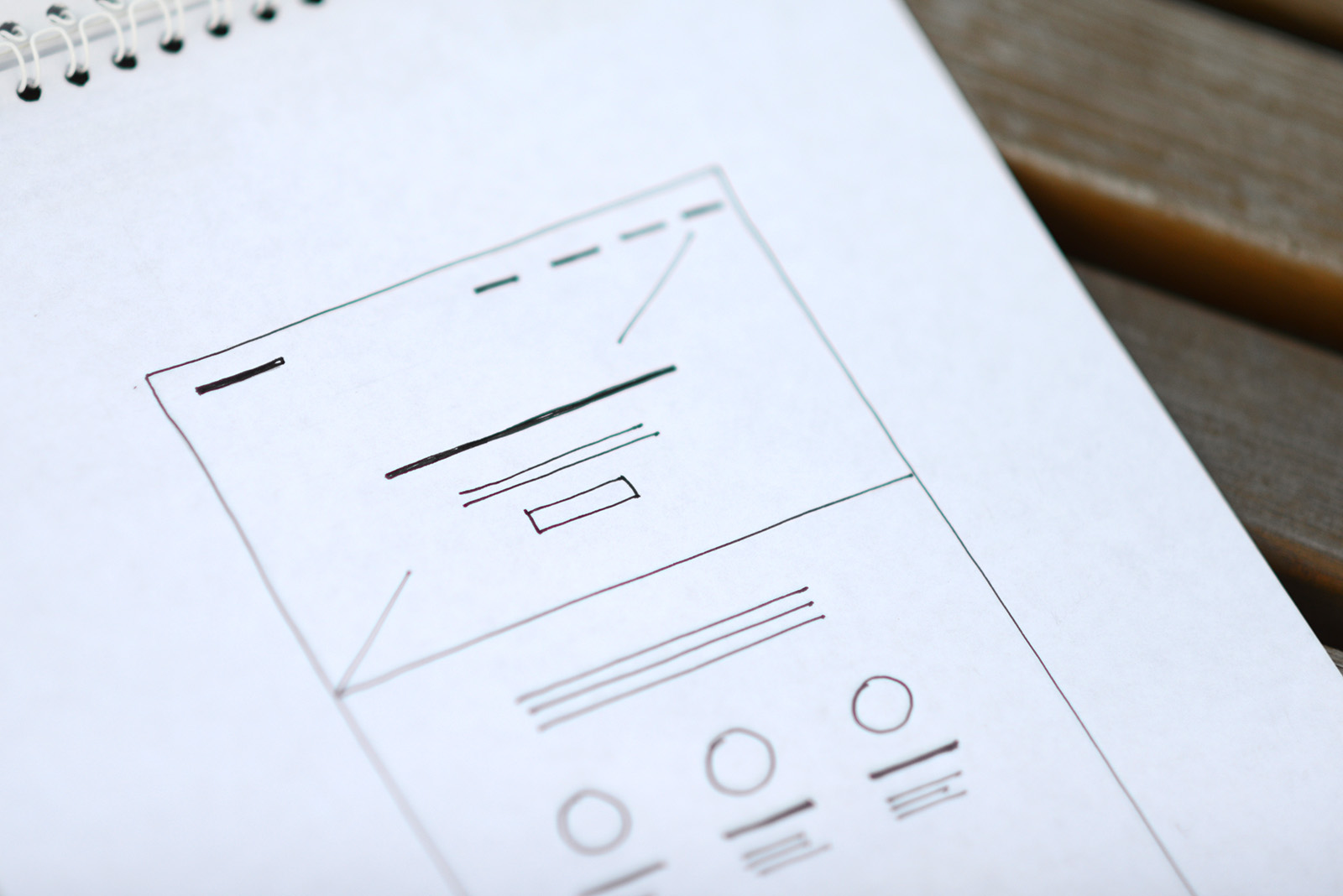
The cover. A bold line for the headline. Thin lines for a short description. Short strips at the top - menu.
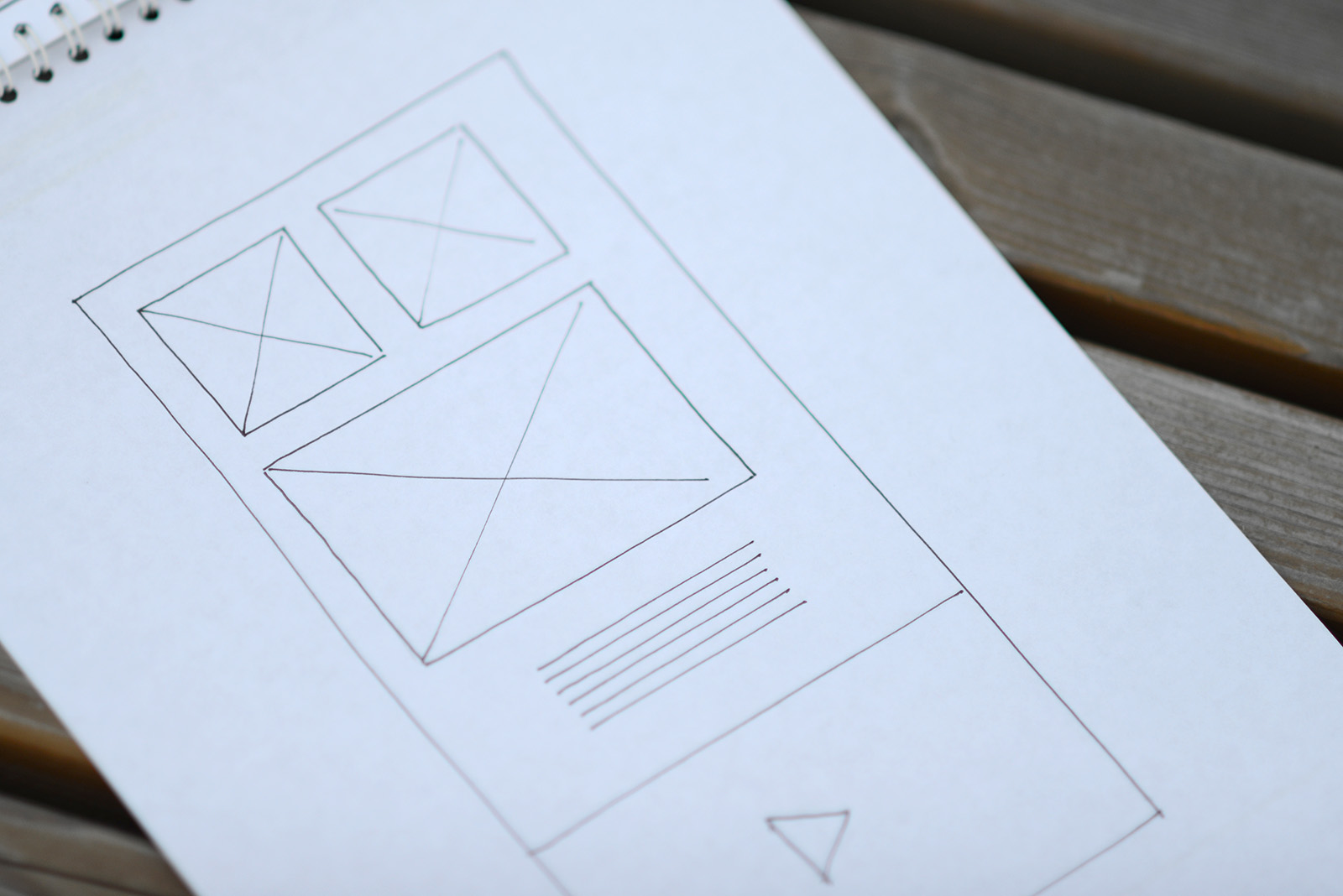
Images are designated as crossed rectangles. The text is indicated by straight lines.
If the image is full screen, draw it like it will be on website.
The text in columns. The bold lines - titles.
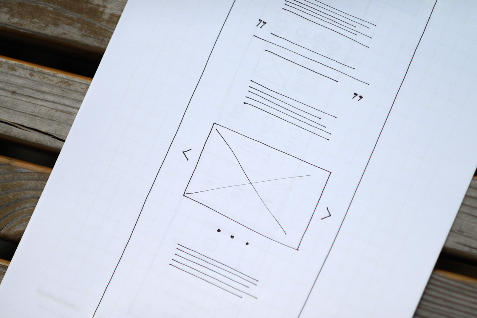
Image Gallery - crossed box and control elements.
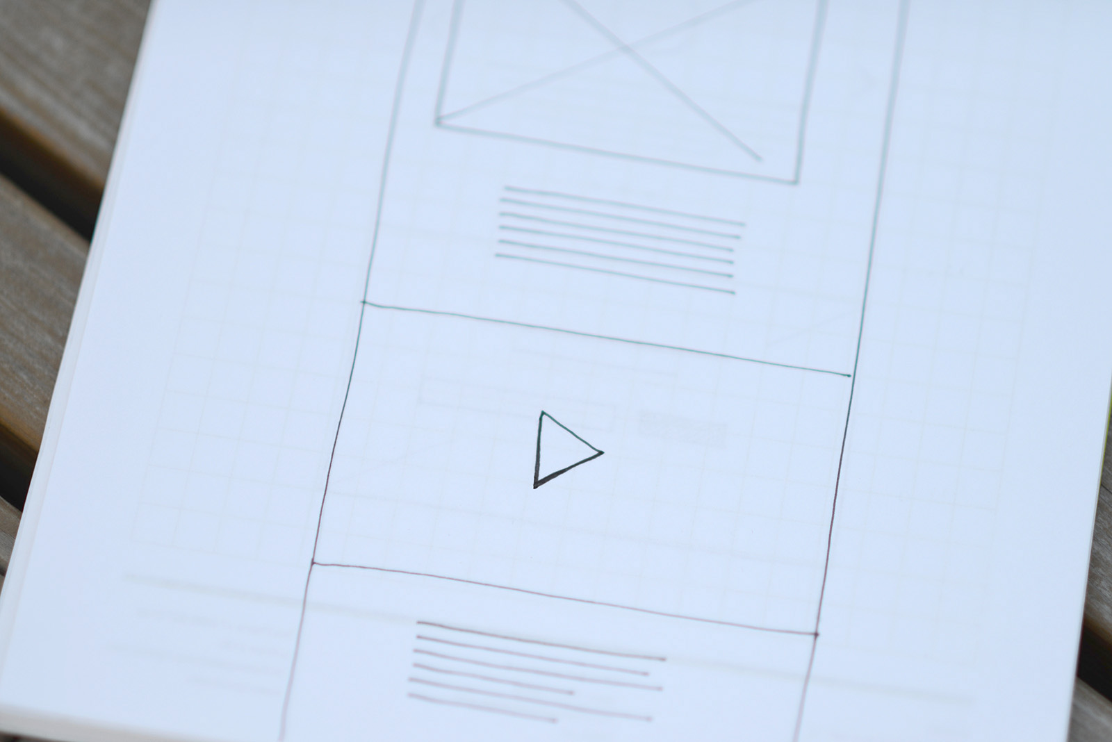
Video is traditionally designated as a triangle.
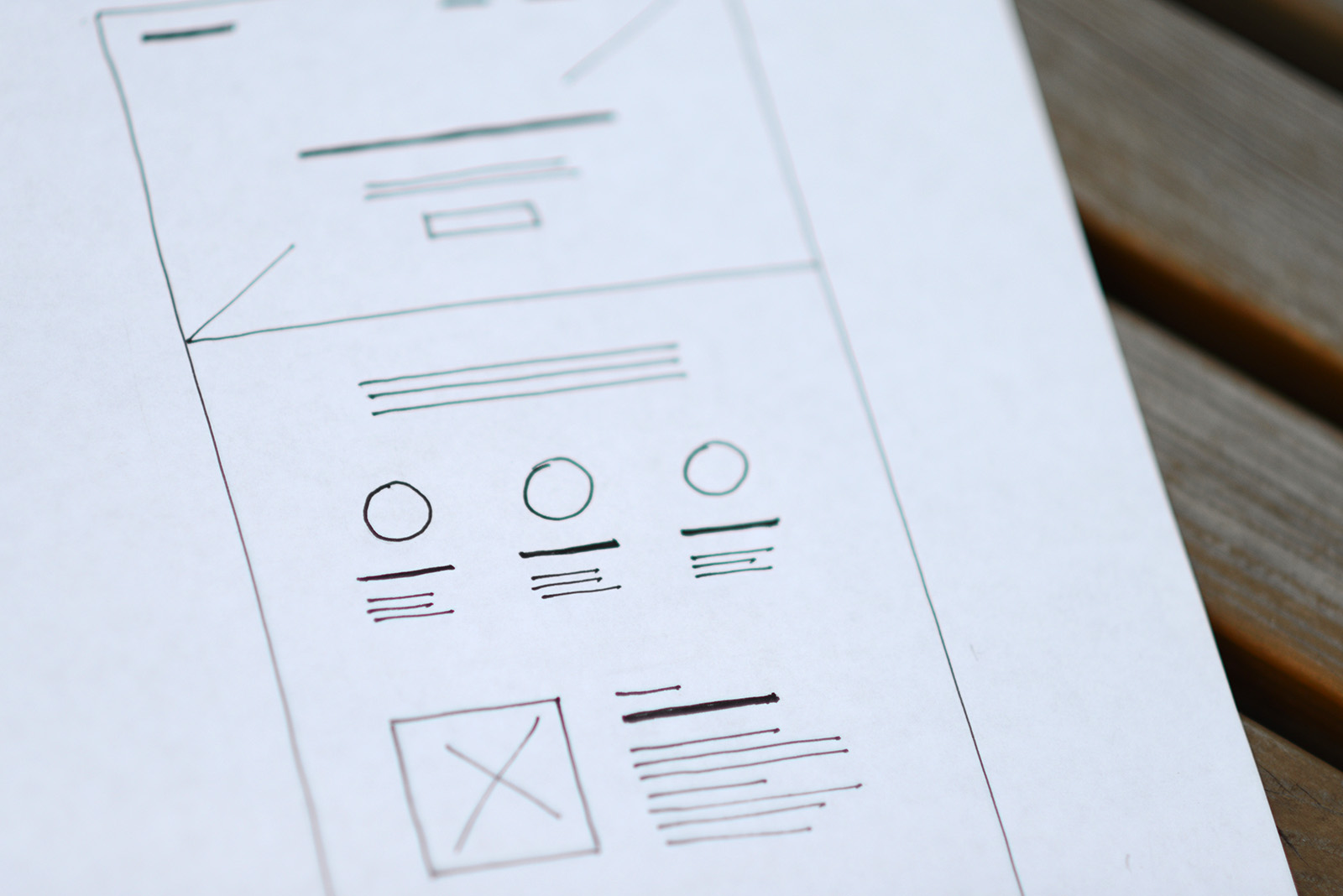
Main features - a schematic representation of icons and text in columns.
4
Content
Where to get the information for the website. How to write the text for the website: main points. Text style.
Information source. Before proceeding to Tilda, you need to take care of the content, as without one you will have to redo everything. First collect all available materials: presentations, brochures, publications. They will serve as a starting point.
First of all, answer the question: "Why am I good?"
If you are making a website for a client, then it's a good move to take the client's interview. Talk to the person and record it , ask questions — nothing specific, just be interested and try to understand why your client is popular.
Transcribe the recording yourself or hire someone to do it. The text can be edited for a small extra fee and you will finally have a letter.
Transcribe the recording yourself or hire someone to do it. The text can be edited for a small extra fee and you will finally have a letter.
All texts should be written in a text editor, not on the website. Don't write and develop the design of the page or website at the same time. Its a lot faster to edit in a text editor — to cut, copy, move. Its a lot easier to do the design when the text is ready.

• How to write the text for the website. If you are writing the text by yourself, use the plan below.
• Write a short text about yourself, your company, This should be one phrase that clearly and capaciously defines what you do. For example, Tilda — a service which helps to create an impressive website without technical skills.
• Expand the text a bit, explain what you do. Use simple wording, write as if you are speaking with a friend over a cup of coffee — be comprehensible.
• Highlight three features including the resins why people like you or your product.
• Describe advantages. Tell how your product solves the problem or your client, give details.
• Think about the headlines. A good technique is to change short and formal headlines like "Team," "Contacts," etc. to expressive ones. For example instead of "News" use "Stay tuned," instead of "Contacts" — "Say hi."
• Take a review. Ask your most loyal clients to say a few words about you. It works great.
Don't use commonplace phrases such as "young, dynamic, developing team."
• Make up three key numbers, people like numbers. However try to make them sensible, comprehensible and full of meaning to users. Avoid abstract sizes such as: serviced 1000 clients, drank 200 litres of coffee, sold 38 000 teddy bears. A good example: 7,5 - an average IELTS exam score among our alumnus. 3 minutes - the time of the film being copied from one device to another using the app.
• Show the team if its strong. An individual is always interesting, people trust real people more than an abstract company.
• Tell about partners or clients, if you can be proud of them.
• Indicate your specialty. If your bar has a wide selection of craft beer, point it out separately.
• Show the team if its strong. An individual is always interesting, people trust real people more than an abstract company.
• Tell about partners or clients, if you can be proud of them.
• Indicate your specialty. If your bar has a wide selection of craft beer, point it out separately.
Text style. Be newsy. Don't go into unnecessary detail — be short and highlight only what is important. Nobody reads long texts. Use the inverted pyramid method — first say what is important, then add details. Here its good to pair headline and summary. The headline must attract attention and convey the essence, the description - to expand and complete the message. Feel free to remove lead-in structures, avoid cliches and bureaucratic style.
General advice: If you really cannot write then hire a copywriter. It's relatively cheap. In this case he will be interviewing you and will provide you with the text. Only don't forget to ask to shorten the text three times.
5
Design
#madeontilda section. Selecting and adapting a template. Navigation on the website. Where to get good pictures for the website. What to do with the logo. Third-party services and special features. Selection of typefaces and font pairings. How to make your website stylish. Publishing the website. Testing.
Sign up for Tilda, if you still haven't.

Study the list of templates. Choose the right one and adapt it. A template is an example of good design and an example of using blocks. Selecting the template does not limit your creativity — at any moment you can change it beyond recognition, and even start with a clean slate.

Check out the section #madeontilda. Here you can find fine examples of finished websites that were made by other users.

Open the Block Library and build a website based on a prototype that you have created. Don't edit the text in Tilda, first make the design. If you don't have the images yet, use high-quality samples that are similar in style, then you can replace them.
Video on Tilda Basics: see how block editing feels like on Tilda.
Navigation. Add the menu, make sure that it is visually good: not too big, does not dominate the page. There shouldn't be too many items in the menu, not more than 5 is the best. Feel free to make the sections bigger. Make short names. Three words in one menu line are clearly not necessary. They must be read at a first view.

Five is the best number of menu items.
The cover (first screen) deserves special attention. The fist impression will be good if there is a high-quality picture and a catchy, not beaten headline.
Where to get good pictures. Photos are important, without them nothing will work out. No photos - no website. Do not use clip-art photos. Handshaking businessman and smiling housewives are yesteryear, these photos do not work. It is better to take a picture of yourself and your colleagues, than to look for ready-made pictures while googling "successful entrepreneur".
Hire a photographer or illustrator. Famous illustrators and photographers are expensive, but the market can offer many relatively inexpensive professionals, they are happy to work for you and you will immediately get good content for your website.
If you need icons use thenounproject or fortawesome.github.io.
Logo. The logo must be horizontal. Vertical logos on the web don't work well. As a rule, the logo is in the menu, which should not take up much space on screen. If you don't have a logo, then simply write the name of the project using a non-system font, such as Proxima or Futura. Do not torment and bother yourself with the logo, if you have a limited budget. At this stage its not as important as the overall impression of the website. Its better to think about the photos and general style.
Third-party services
Timeline of events — Timeline.knightlab
Interactive maps — Storymap.knightlab
Tickets sale for an event — Weemss
Interactive images — Thinglink
Feedback — Uservoice
Accepting money — PayPal
Online store — Ecwid or Shopify
In general, if you have a specific feature, use the block "Embed HTML code." If you need a unique element, ask developers to build it.
Font. Be sure to include a signature font, it affects communication. Now everything rests on the content, so the font itself will define your signature style. Each font has a character, so try to pick a font that matches the content.
As a rule, a single font is enough for a website. But if you want to achieve spectacular contrast, use pair fonts: serif and sans-serif fonts. Examples of successful font combinations:
As a rule, a single font is enough for a website. But if you want to achieve spectacular contrast, use pair fonts: serif and sans-serif fonts. Examples of successful font combinations:
The overall style and accuracy. Once you designed all the blocks, take a look at the website and see if it looks nice and neat. Align the indentations, make headlines uniform, make sure the font size of the text is everywhere the same. Make sure the site has enough free space.
Try to be austere. The simpler — the less mistakes and the website will be stylish.
Use signature colours. But that does not mean you have to paint all in different colours. Instead, follow the rule that 90% is black and white and 10% is the active colour. One additional colour is the best option. Definitely not three. Two can be used but very carefully.

If you have no experience in the design and nothing seems to be working out, write the content, make a version of the webpage on Tilda and hire a designer for a limited period of time. A professional designer will quickly arrange the webpage, and you will cut the costs several-fold in comparison to ordering a website from scratch. If you are a designer, ask your friend designer to look at it and comment on what you got. A fresh look will always immediately give feedback.
Publishing the website. Connect the domain. For this you should list the address in the project settings, and indicate where the domain was purchased in the registrar, specify the IP in one line.
Don't forget about statistics. Sign up for Google Analytics, get the code and add it in the settings.
Mind how your website will look like on search engines or social networks and fill in the name and description. Provide each page with a small photo, then when your page is shared it will be properly framed.
Testing. You made a website, now you need to get the first reviews. Show the website to your colleagues or friends, ask them what they think. Send the link to your customers and ask for their opinions.
The website of your dreams starts right here!
If you like the article, share it with your friends. Thank you!
