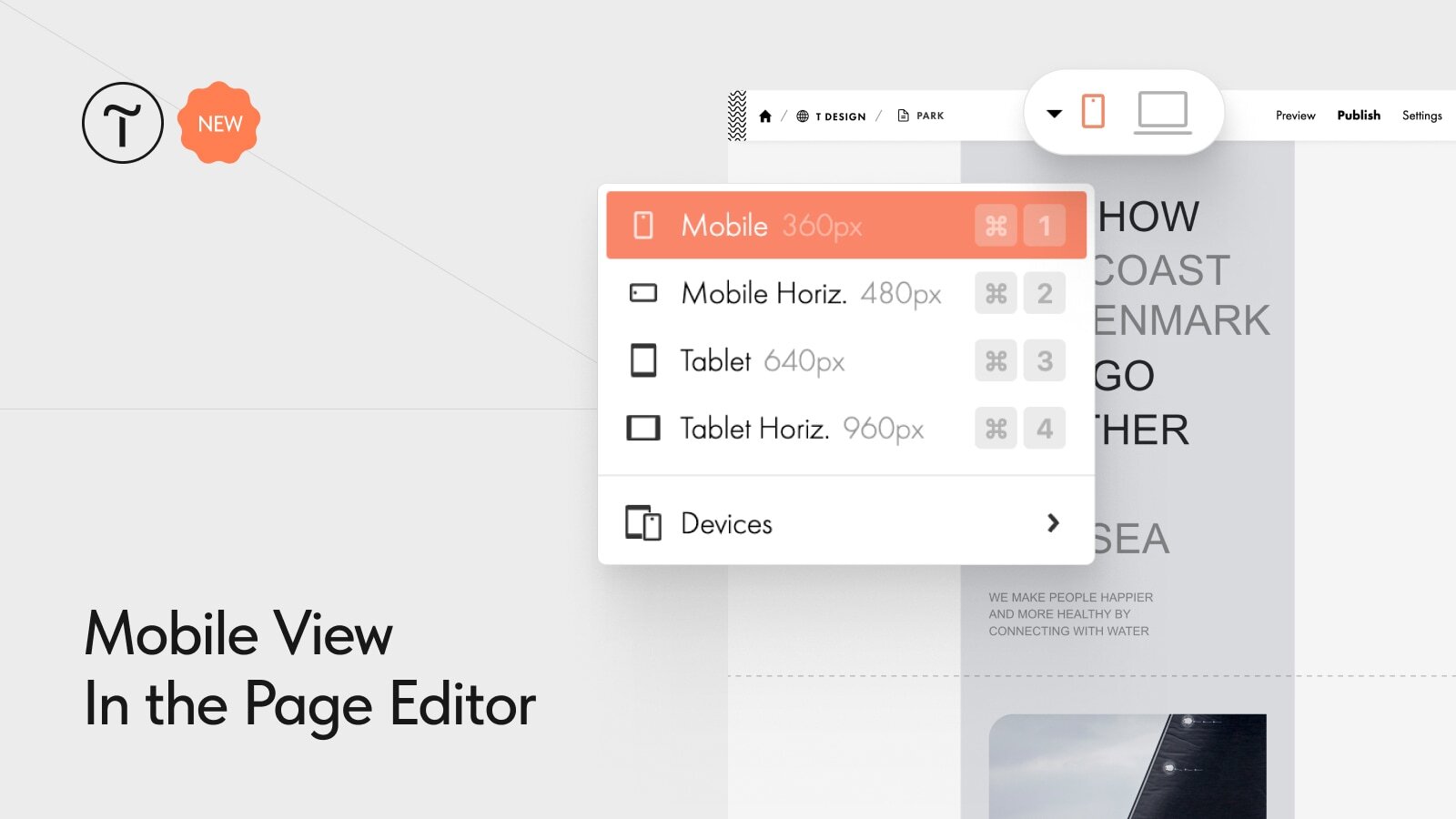
The page Editor now supports mobile view. You can select mobile, tablet, or choose a specific device like the iPhone 15 Pro or Redmi Note 8 from the drop-down menu. You can also set a custom width by dragging the block's sides. The height adjusts accordingly.
Mobile view helps you see how your page will display on smaller screens before publishing. For an exact look, use the Preview mode or check it on a real device after publishing.
When previewing a page in mobile view, all settings are preserved, allowing you to see how it looks and functions on mobile devices. If there is a Zero Block, it will be displayed according to the configured breakpoints.
