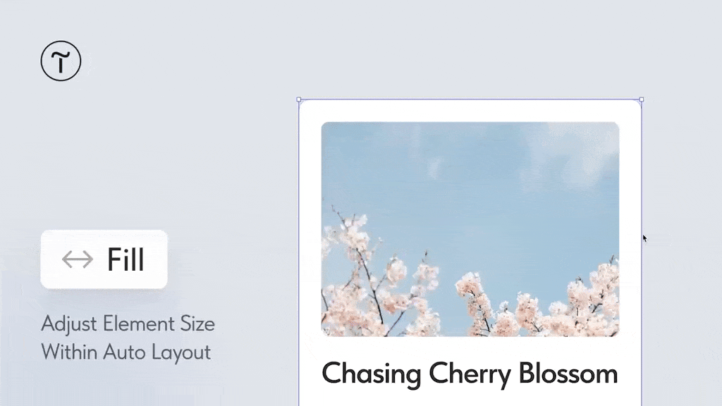
The new Fill setting makes elements in a group with Auto Layout applied automatically align according to the available width and/or height and adjust to size changes.
Where to find: Select an element → Element Settings → Fill.
If multiple elements in a group have the Fill setting enabled, they will evenly fill the container. For example, two elements will each take up 50% of the available space, three will take up 33%, and so on.
The setting can be particularly useful in several scenarios:
• When creating the mobile version: Elements will automatically align based on different screen widths, speeding up the process.
• For designing product cards, when you need to stretch images, text, and buttons across the container's width.
• When creating lists or image galleries, to ensure each element takes up equal space.
