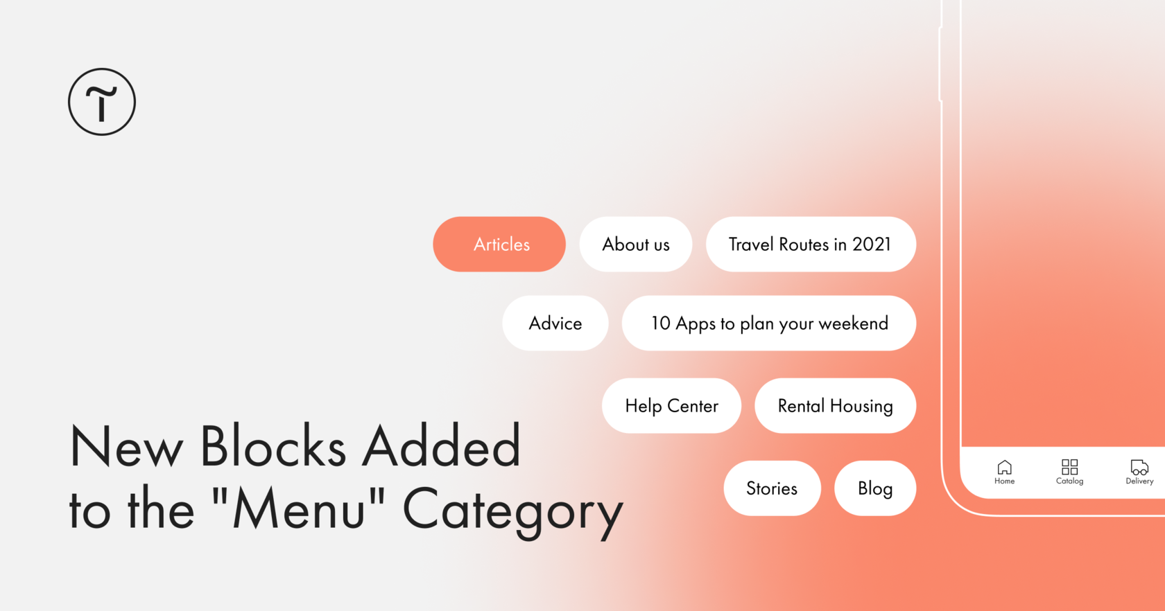
🌸 Block ME503. Mobile menu fixed at the bottom
ME503 is a mobile navigation bar that is displayed on screens up to 640px wide by default. While scrolling, the menu is always fixed at the bottom of the screen to make it easier and faster to navigate through the website. In the Settings panel of the block, you can disable the menu while scrolling up.
💪 You can add any number of items to the menu: if there are more items than fits on the width of the smartphone screen, a horizontal scroll will appear so that the items take up less space.
You can add items using cards–they are handy to copy and move around when designing navigation.
For each menu item, you can add icons from the Tilda free icons library or use your own. You can also adjust the opacity of all elements or just the active one.
🌸 Block ME606. Menu with tabs
A large menu with tabs will work if you need to create a second-level menu or set up visual navigation for a large number of sections.
👉 In the Settings panel of the block, you can adjust the block width, offset, and customize menu items alignment: center, left, or right. You can choose from three menu sizes: small, medium, or large.
Menu items are fully customizable: adjust the opacity, background color, border width, color, and radius. You can modify the style of the active item and the style of the items on hover, set a distance between the items, and much more.
The block is visually similar to ME602 and ME603 but is used for other purposes. If you need to show or hide content by switching tabs, use the blocks ME602 and ME603.
😻 See the new blocks: https://blog-en.tilda.cc/new-blocks-more-menu-march2021

