🙌 Here are 4 ways of improving website navigation in no time. All you need is a couple of simple Tilda tools. If you're a designer, a marketing professional or an entrepreneur who wants to build a website without hiring a designer, these tips are for you.
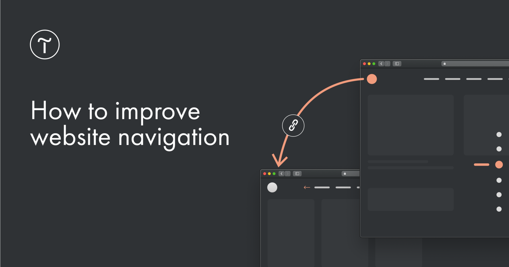
1. Link the logo to the home page
Many modern websites follow this trend today: when the visitor clicks a logo in the header, they're taken to the top of the home page. That's why feel free to remove the Home section from the menu but don't forget to add a link to the logo.
To create a link to the home page on Tilda, just add a forward slash (/) instead of the full URL in the block settings.
2. Fix the navigation menu
👍 To help site visitors find the section they're looking for wherever they may be on the page, create a fixed menu. It will always stay in sight when scrolling.
To create a fixed menu, go to the block settings, click Main settings, then Menu position behavior and select Fixed.
3. Highlight the active menu item for page navigation
Show the user which section of the website they're visiting — add the display of the active menu item in the block settings.
There are several options for highlighting an active menu item: you can change its saturation, opacity and color. Or even underline or cross it out.
4. Add indicators to the right and show visitors where they are on the page
✨Dot indicators don't distract from the content. They simply give you a clue as to where you're on the page. On Tilda, these navigation hints come with a tooltip that includes section names for intuitive navigation. Find them in the block ME604 from the Menu category.
A well-planned navigation allows the user to linger on the website, explore internal pages and come back in the future.
