✔️ The colors located close to each other on the color wheel combine best in a gradient. E.g., violet and blue or different shades of blue.
❌ Complementary colors, e.g., violet and yellow, create a gray transition if blended.
Why Does This Happen?
When you blend complementary colors, they go through the zero-saturation middle— the "gray dead zone"—and become less intense and dull. To visualize it, take the color wheel and draw a straight line between the colors selected for the gradient. If the straight line goes through the middle, you won't get a beautiful gradient of these two colors.
How to Avoid Gray Zone when Creating a Gradient?
Add in-between shades of similar intensity, e.g., orange, red, pink. The blending should follow the curve bypassing the gray zone. Use at least 3-4 additional shades with the main colors located far from each other on the color wheel.
You can select the colors by yourself or use a color gradient generator, e.g., this one 👉 https://learnui.design/tools/gradient-generator.html
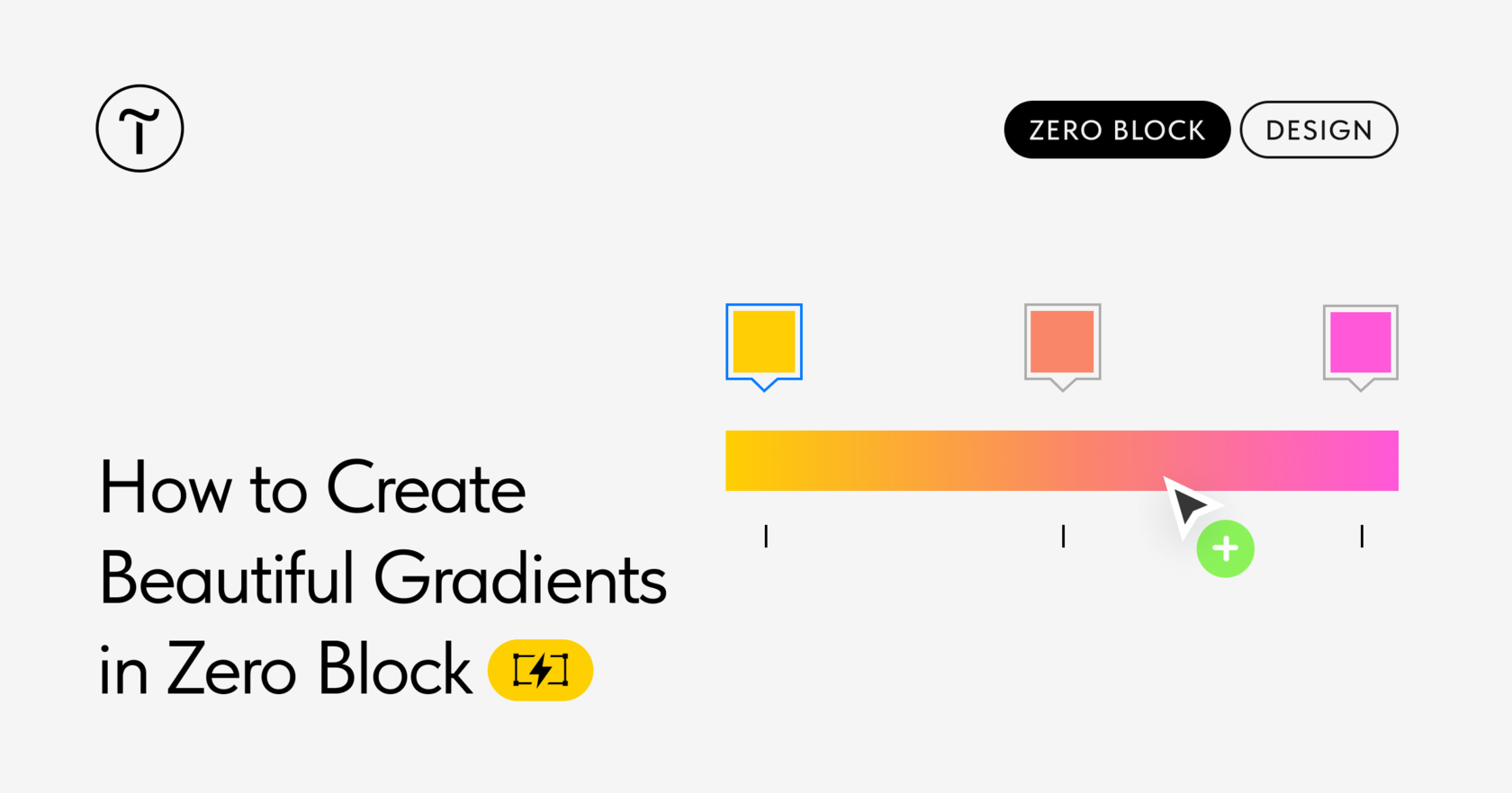
💫 How Do I Create a Multicolor Gradient in Tilda's Zero Block?
Select the element and open its Settings → Background Color → Linear or Radial. Set the two main colors. Then hover the cursor over the gradient panel so that the "+" button appears and you can add another color. Repeat it for all in-between colors.
To delete the color, click on it and drag it down.
More about gradients in Tilda's Zero Block 👉 https://blog-en.tilda.cc/gradients-in-zero-block
